Optimize your Business for the Mobile-First Index
The usage of internet in mobile phones has gained prominence over the years, eventually becoming more common than desktop internet usage by January 2014, according to this Wikipedia post. Owing to its exponential growth in the past few years, Google has announced that they will be rolling out a mobile-first index in 2018 for their search listings. This has prompted businesses to alter their online presence and user experience, to rank better in SERPs. But before we dive into that, what exactly is mobile-first index, and how does it work?
As the name suggests, mobile-first indexing uses the mobile version of a website as its primary point of reference for indexing and organic ranking, even for listings shown on desktops. This means that Google’s algorithm will go through the mobile version of a website first to determine its indexing and search ranking, based on several factors. So what exactly do businesses need to do, and how can they adapt to mobile-first indexing?
Let’s take a look at the top five steps that businesses can follow to optimize their online presence for mobile-first index:

Step 1: Make Sure Your Website Has a Responsive Design
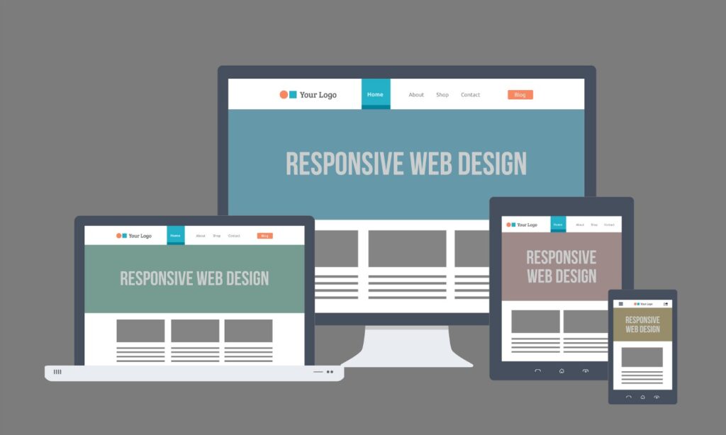
Googlers highly recommend taking a responsive approach for the switch to mobile-first indexing. This entails optimizing a website so that it renders the content according to the screen real estate, without making any changes in the content itself. Websites that have a responsive design or a dynamic serving structure will see little to no change in their SERP rankings, says Google.
Pro Tip: You can run Google’s test to check if your website is mobile-friendly
here

Step 2: Make Sure Your Page Loading Speed is Maximized
Lorem ipsum dolor sit amet, consectetur adipiscing elit. Ut elit tellus, luctus nec ullamcorper mattis, pulvinar da
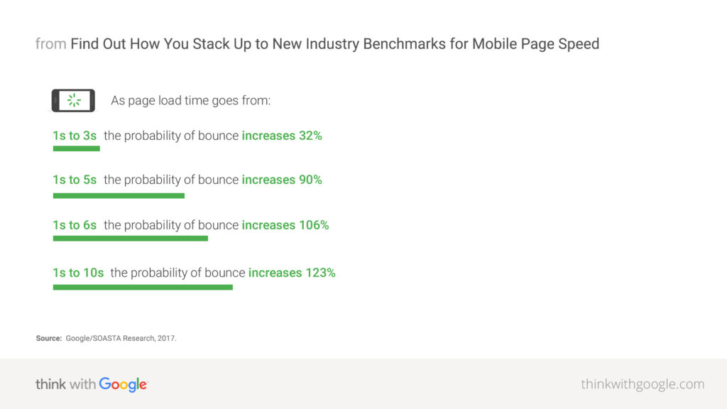
According to this article by Google, 53% of mobile users bounce from a web page that takes longer than three seconds to load. Given this statistic, we can conclude that page loading speed plays a vital role in optimizing your business’ mobile user experience.
You can achieve higher loading speeds through several changes, the most basic being compressing and optimizing your rich data. For example, using a high-resolution image for use on a small screen doesn’t make sense, and it loads slower. Whereas, using a resolution that matches the screen size can deliver the same experience, but with a reduced loading time. Additionally, make sure that your JavaScript and CSS are responsive and adaptive, and that white spaces and empty elements are removed.

Step 3: Optimize For Local/Near Me Searches
Google states in its research article that nearly one-third of all mobile searches are related to location. This opens up a whole new avenue of potential revenue, and optimizing your business for these search results and listings has become paramount with the introduction of mobile-first index.
You can equip your business for this by adding your listing details across multiple online directories, such as Google My Business, Yelp, Foursquare, and even social platforms. Perhaps the most important thing to oversee here is to make sure your info is accurate and consistent across all directories and online platforms. Do make sure to include your working hours and special holidays, in addition to your name, address, phone number (NAP) details.
Pro Tip: Including your city and state in your title tag, URL, alt tags, etc. will also help with local searches.
Step 4: Optimize Your On-Page Content
Search result listings on smartphones have considerably lesser space to work with, in comparison to listings shown on desktops. Since more than half of all web traffic originates from mobile devices according to this Statista analysis, making sure your titles and meta descriptions are clear and concise is extremely important. This helps users make an instant decision, and consequently have a better user experience.
Step 5: Make Sure Your Design Layout is User-Friendly
With the smartphone’s consistent rise to power, the way people navigate a site has changed considerably. Fingertips have replaced cursors, and any website layout that does not offer a ‘finger-friendly’ layout tends to have a higher bounce rate. So make sure that your layout isn’t cluttered, and is presented in a way that makes it easier for mobile users to navigate.